Athletic Shoot by Michael Donnelly

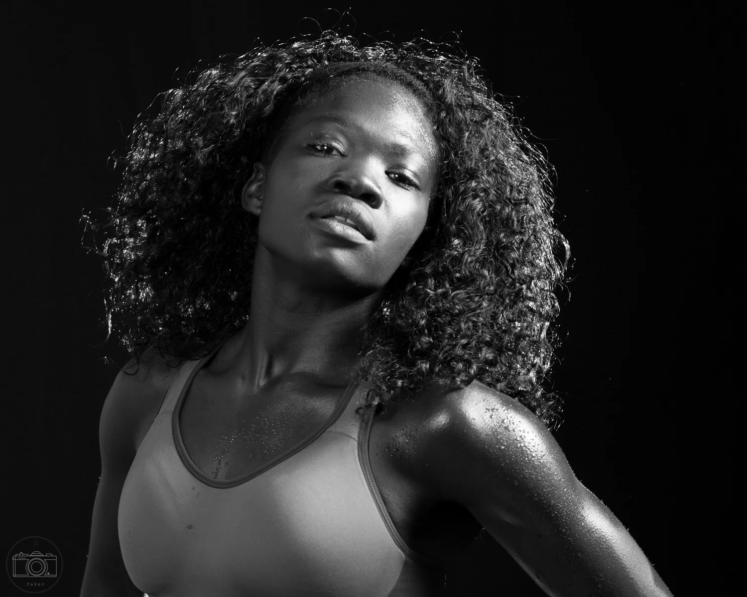
I wanted to do a shoot with a fitness model, to try to capture not only the appeal of the model, but also the effort and determination required to become strong.  I had in mind one of those sweaty, black and white type shots you see on Sports Illustrated covers from time to time.

The biggest win in this shoot is that I got to work with the amazing Susan Yen -- she killed it in both the posing department and the being-4000-percent-more-fit-than-I-will-ever-be department.

My plan for the lighting was to blow a gridded softbox across the plane of her face, fill with a shoot-through umbrella, and use a hairlight behind her to pull her off of the background, something like this:

It's awfully crowded in there...

It's awfully crowded in there...

I added a reflector to bring up her skin tone in the black and white images, so there was a lot going on in the studio that day.  The key light and the hair light were firing in ETTL mode, with the key light at +1EV to account for the gridded softbox, and the hair light at -2EV.  The fill light was on manual at 1/32 power.  I really like the Yongnuo YN-E3-RT for its ability to manage different groups in a mix of manual and TTL modes.

I was shooting tethered into Lightroom using the low key black and white filter -- that filter was much too dark, so I'm glad I had the in-camera images.  With the lighting set-up above, I ended up getting a good selection of black and white portraits, so we turned the hairlight around to be a kicker on the background and reversed the ratio on the key light and fill light, and took some more traditional portraits in color as well.

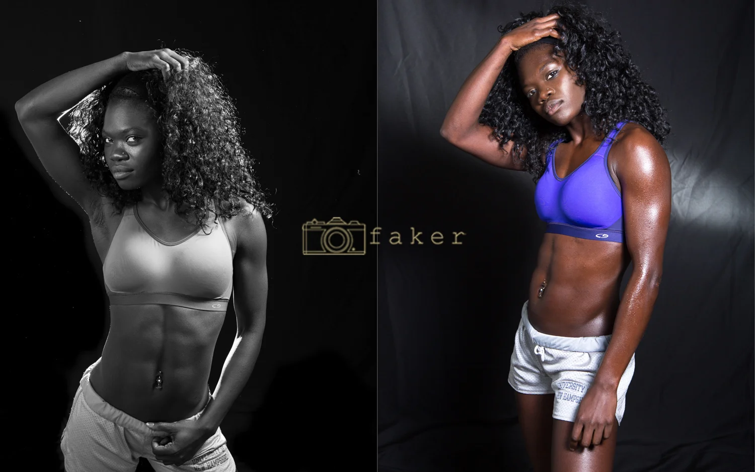
In my quest to get that "fitness" look, I somehow convinced Susan to allow me to put "fake sweat" on her.  We painted one side of her with off-brand olive oil and spritzed her with a mister -- the beads of sweat really stayed in place well.  I think we did pretty well capturing the original intent of the shoot:

The sweat is fake...

The sweat is fake...

Eventually I burned through all 16 AA batteries I had brought with me, but we got a bunch of good shots.  Take a look at the whole gallery and let me know what you think!

Mood Lights by Michael Donnelly

While I was looking at strobe modifiers, I watched this video tutorial from Adorama by Gavin Hoey.

http://www.adorama.com Honeycomb grids are designed to channel the light from your flash into a small area and in a small studio they are an essential tool for directing light just where you want it. In this video, Gavin Hoey sets up a dramatic shoot using just two lights with grids as well as showing you what happens when you shoot without grids.

I really liked the way the two lights worked together to expose the subject but create negative space.  I think they nailed this complementary pairing of subject and motif, but I thought this could work really well with a softer, more romantic female subject.

I wanted to use a model and setting which were still edgy, but less urban industrial than in the video above.  I was lucky enough to work with Kristin, who had to put up with a lot of shenanigans while I got things together. The studio in the video has a gray wall with a lot of textured character on it.  That was important for both the character of the overhead light and the gritty feel.  I didn't have access to that, but I chose a gray fabric that had a bit of texture in it.

 
Fabric Backdrop

Fabric Backdrop


I liked this as we began the shot, but as the model was posing on the runner of it, it started to bunch much more than seamless or a solid surface would have.

Next it was time to tackle the lighting.  My ideal set-up would have been the same as in the video, but I ran into a number of issues.  The general layout of the lighting (for the TL:DW; crowd who skipped the excellent video above) was:

Unfortunately, I ran into a bunch of problems that would have been solved by $5000 -- namely, that my cheap pursuit of "studio" gear from amazon that cost less than $100 let me down.  The first problem was in the lighting ratio.  Ideally, the shoot would be done with strobes at about a 3:1 ratio (after modifiers) between a gridded overhead strobe and a fill strobe in small/medium beauty dish (with grid) on the face.  I had purchased two Neewer clones of a flashpoint rovelight along with a generic boom stand and sandbag ... well, no amount of sand was going to hold that light up on on that stand without concussing my poor model, so I had to give up and use my YN-600ex-RT speedlight (with Gary Fong grid -- the only good part of the Gary Fong system) as the overhead key light.  The power on the speedlight (which I heartily endorse when it's used for its intended purpose) was much less than on the strobe, so I had to open up the lens more than I wanted, which meant we had to drop the ambient light to almost nothing.  This gave some challenging focus issues (I would pump the modeling light through the fill strobe to autofocus, then click the lens into manual so that it wouldn't seek during the shot.)  The second part of the problem is that I had planned to use the speedlight as the fill (at the lower end of the ratio,) and the beauty dish I had for that light needed a lot of banging with pliers to accept a giant strobe.  Once the strobe was in there, it tried routinely to blind my model.

Anyway, once we got our lights attached to their OSHA approved mounts, I focused on getting the background properly exposed at f5.6 -- this is tough, because the background/overhead light is really the key light in this shot, and the feathering across the face is the main exposure for the model, even though it doesn't give traditional exposure -- thus the extreme modifiers on the "fill" light.  Anyway, we finally got the speedlight, on TTL at +2EV, to give the correct overhead exposure:

Overhead Key Light

Overhead Key Light

You can see a few things here -- first, we have the "cone" shape we want for the overhead exposure [good].  Also, Kristin's forehead, nose, and upper lip are properly exposed (give or take a butterfly shadow), as we want from the "key" light, even if her eyes are straight up goth deadpool [also good].  You can also see her amazing purple hair, which helped us so much in this  shoot.  ...You can also see the "texture" of the background turning into 3-D wrinkles as it runs along the floor [not good at all.]  The next step was to fill in the shadows on Kristin's face.  It took me a long, long time to pull this off, which is why she looks so justifiably bored:

Filling in some shadows.

Filling in some shadows.

You can see in the shot above that we have the shadow of the model off-center in the "key light" cone -- this orientation is one of my biggest personal failings in this shoot.  I didn't pay attention to it enough, and lost a lot of shots where the model's face was exposed by the beauty dish but I was shooting off axis, and she was outside the cone of light.  You can also see, though, that we still have some shadows in the eyes, which will work really well for us once the model poses, to get shadows off her excellent lashes -- you can't be goth without excellent eyelashes, FYI.

We worked through face angles, and traditional body posing, and came up with something like this (remember, up until now, none of these are actual "shots", just tests):

Ignore the absolute lack of focus, this is the framework for the shot we want.

Ignore the absolute lack of focus, this is the framework for the shot we want.


The next thing we did was work at turning this angle into a pose, and, apparently, my direction was hilarious:

fer teh lulz

fer teh lulz

Stretching the torso in a twist, offsetting the hips, and pumping up the contrast on the model's sleeve worked really well for us, despite my inability to direct effectively.  You might notice that the lighting has drifted a bit from the lighting in the video.  ...we actually did a pretty good capture of the unprocessed light set-up in the video:

Lighting isn't everything...

Lighting isn't everything...

...but the squared hips and shoulders, which work well to create a slightly intimidating male figure in the video, aren't right for our model.  Having Kristin turn her hips to the side and hitting her straight on with the beauty dish gave us a start for the set-up:

Hello, lightstand!

Hello, lightstand!

Eventually, we came up with some pretty good shots.  This was my favorite:

Check out the whole gallery and let me know what you think!

ย